Checkboxes, radio buttons, and menus

Checkboxes, radio buttons, and menus

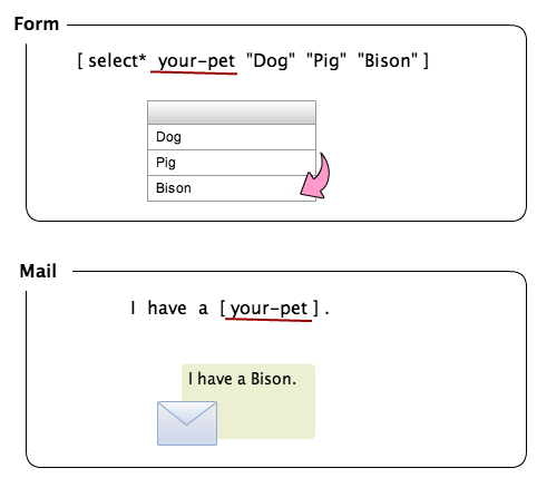
Contact Form 7 provides several types of form-tags for representing checkboxes, radio buttons, and drop-down menus. This article explains about the usage and semantics of these form-tags.

Checkboxes and radio buttons#Checkboxes and radio buttons

Both checkbox and checkbox* represent a group of checkboxes ( in HTML). checkbox* requires the user to select at least one of the boxes.

radio represents a group of radio buttons ( in HTML). Because a group of radio buttons is naturally required, a radio form-tag works as a required field. It is advised to preselect an option in a radio button group using the default:1 option.

OptionExamplesDescriptionid:(id)id:fooid attribute value of the wrapper element.class:(class)class:barclass attribute value of the wrapper element. To set two or more classes, you can use multiple class: option.default:(num)default:2default:1_2_3Preselected options. The integer following default: is the position in the order of items. 1 is the first one. If you want to make two or more items selected, joint integers with underbar (_), as default:1_2_3.label_first By default, a checkbox or a radio button are put first, and a label last. By adding label_first option, you can reverse them.use_label_element Wrap each checkbox and radio button with

These types of tags have one or more values, and the values will be used as the values and labels of the checkboxes or radio buttons.

Example:

[checkbox your-country "China" "India" "San Marino"]

Drop-down menus#Drop-down menus

Both select and select* represent a drop-down menu ( in HTML). select* requires the user to select at least one option from the menu.

OptionExamplesDescriptionid:(id)id:fooid attribute value of the select element.class:(class)class:barclass attribute value of the select element. To set two or more classes, you can use multiple class: option.default:(num)default:2default:1_2_3Preselected options. The integer following default: is the position in the order of items. 1 is the first one. If you want to make two or more items selected, joint integers with underbar (_), as default:1_2_3.multiple Make the drop-down menu multi-selectable.include_blank Insert a blank item into the top of options of this drop-down menu.first_as_label Use the first value as a label.data:(name)data:countriesGet the values from Listo.

These types of tags have one or more values, and the values will be used as options in the drop-down menu.

Example:

[select your-country "China" "India" "San Marino"]

See also

Selectable recipient with pipesCustom layout for checkboxes and radio buttons

Demo#Demo

Note: This is a demo form and it doesn』t send an email practically.

Select Country (required)
ChinaIndiaSan Marino
Select Sports
FootballTennisPole-vault
Select Fruit (required)
AppleBananaGrape
Select Browser (required)
---FirefoxSafariOperaLynx
Select Ghkdsjdf
fsdfsklgjfkvdrie

Δ

View source of the preceding form:Select Country (required)
[checkbox* your-country use_label_element "China" "India" "San Marino"]

Select Sports
[radio your-sports label_first default:2 "Football" "Tennis" "Pole-vault"]

Select Fruit (required)
[checkbox* your-fruit exclusive "Apple" "Banana" "Grape"]

Select Browser (required)
[select* your-browser include_blank "Firefox" "Safari" "Opera" "Lynx"]

Select Ghkdsjdf
[select your-ghkdsjdf multiple "fsdfs" "klgjfk" "vdrie"]

[submit "Send"]
Share this:FacebookTwitterLike this:Like Loading...

File uploading and attachment

File uploading and attachment

In this post, I will explain the file uploading and attachment feature of Contact Form 7. With this feature, you can allow your users to upload their files via your form, and then an email with attachments of the files is sent to you.

To set up, two steps are needed: 1) Add file uploading fields in your form, 2) Set up your mail settings to attach the uploaded files. The two steps will be explained in the rest of this post.

Adding file uploading fields in your form#Adding file uploading fields in your form

Like for other types of form fields, Contact Form 7 provides form-tags for file uploading fields ( in HTML): file and file*. file* is a required field and requires the user to upload a file.

OptionExamplesDescriptionid:(id)id:fooid attribute value of the input element.class:(class)class:barclass attribute value of the input element. To set two or more classes, you can use multiple class: option, like [file your-file class:y2008 class:m01 class:d01].filetypes:(filetypes)filetypes:gif|png|jpg|jpegAcceptable file types. List the file extensions after filetypes:, and separate them with 『|』 (pipe) character when you set multiple file types.limit:(num)limit:1048576limit:1024kblimit:1mbLimit the max file size acceptable. You can use kb (kilo byte) or mb (mega byte) suffix optionally. If you omit suffix, the number means bytes. Note that you can』t use a decimal point in it (i.e., like this: [file your-file limit:1.5mb]) and it will be ignored if it exists.

Example:

[file your-file filetypes:pdf|txt limit:2mb]

Contact Form 7 applies default restrictions for file type and file size when you do not set the filetypes: and limit: (file size) options explicitly. Default acceptable file types (extensions) are: jpg, jpeg, png, gif, pdf, doc, docx, ppt, pptx, odt, avi, ogg, m4a, mov, mp3, mp4, mpg, wav, and wmv. Default acceptable file size is 1 MB (1048576 bytes).

Setting up file attachments with an email#Setting up file attachments with an email

To attach the uploaded files to the mail, put mail-tags corresponding to form-tags for file uploading fields into File attachments field in the Mail tab panel like shown below:

Screenshot of File Attachment field

In this example, the form-tag for the file uploading field is:

[file your-file filetypes:pdf]

Therefore, the corresponding mail-tag to this is:

[your-file]

Note that what you put in the File attachments field is [your-file] (mail-tag), not [file your-file filetypes:pdf] (this is not a mail-tag but a form-tag).

If you have multiple files uploaded and want to attach them into an email, simply line the mail-tags up in the File attachments field like this:

[your-file][your-another-file]

How tags work

Local file attachment#Local file attachment

Contact Form 7 supports local file attachment. You can put local file paths in the File attachments field and those files will be attached to the email as well as uploaded files.

Put a file path per line. When the path is not an absolute path, it will be treated as a relative path to the wp-content directory.

For security reasons, specifying files outside of the wp-content directory for email attachments is not allowed, so place the files in the wp-content or its subdirectory.

Example:

[your-file][your-another-file]
uploads/2013/08/08/boringguide.pdf

How your uploaded files are managed#How your uploaded files are managed

After a user uploads a file through your contact form, Contact Form 7 checks to see if: 1.) Any PHP errors have occurred; 2.) the file type and file size are valid; and then, if the check turns out okay, Contact Form 7 moves the uploaded file to a temporary folder. At this point, Contact Form 7 attaches the file to the mail and sends it. After these procedures, Contact Form 7 then removes the file from the temporary folder.

The location of the temporary folder is wp-content/uploads/wpcf7_uploads by default. It may differ if you have changed upload path setting from wp-content/uploads.

This folder is created automatically, but sometimes it can fail. The most possible reason for this is that the parent folder doesn』t have sufficient writing permissions. In such cases, you can change the permissions or create a folder manually.

You can customize this directory path by defining the WPCF7_UPLOADS_TMP_DIR constant like the following:

define( 'WPCF7_UPLOADS_TMP_DIR', 'your-custom-tmp-dir' );

You can set the constant value to an absolute directory path or a relative path to the WordPress content directory (WP_CONTENT_DIR). Be aware that, even in cases where you set it to an absolute directory path, you can only specify a directory that is located under the content directory. Otherwise, the constant will be ignored.
Share this:FacebookTwitterLike this:Like Loading...

Really Simple CAPTCHA

Really Simple CAPTCHA

[Edit: 2015-09-17] Contact Form 7 4.3 and later recommend reCAPTCHA instead of Really Simple CAPTCHA. For more details, see Contact Form 7 4.3.

Contact Form 7 allows you to insert a CAPTCHA into your contact form to prevent bots from submitting forms. Contact Form 7 utilizes Really Simple CAPTCHA as its officially-sanctioned CAPTCHA module, so you will need to install the Really Simple CAPTCHA plugin before you use CAPTCHA in your form.

The rest of this article will explain how to use CAPTCHA with Contact Form 7, based on the assumption that you have already installed Really Simple CAPTCHA.

Before using CAPTCHA#Before using CAPTCHA

Really Simple CAPTCHA requires that GD and FreeType PHP libraries be installed on your server in order to create CAPTCHA images. If you are not certain if they are installed, ask your server administrator.

Contact Form 7 creates a temporary folder and stores any CAPTCHA files there. In most cases, the location of the temporary folder is wp-content/uploads/wpcf7_captcha, but it can be different depending on your settings.

This folder is created automatically, but sometimes it can fail. A possible cause for this is that the parent folder doesn』t have sufficient writing permissions. In such cases, you can change the permissions or create a folder manually.

How to use CAPTCHA#How to use CAPTCHA

To add a CAPTCHA into your contact form, you must utilize captchac and captchar form tags.

captchac means CAPTCHA-Challenge and it represents an element for a CAPTCHA image. captchar means CAPTCHA-Response and it represents an element for a response input field.

A captchac tag must always be paired with a captchar tag with the same name. For example, tags shown below are valid:

[captchac captcha-1] [captchar captcha-1]

But these are invalid because they have different names. In this case, the CAPTCHA and its response do not match:

[captchac captcha-2] [captchar captcha-3]

CAPTCHA-Challenge#CAPTCHA-Challenge

captchac means CAPTCHA-Challenge and it represents a CAPTCHA image ( in HTML).

OptionExamplesDescriptionid:(id)id:fooid attribute value of the img element.class:(class)class:barclass attribute value of the img element. To set two or more classes, you can use multiple class: option, like [captchac your-captcha class:y2008 class:m01 class:d01].size:(sml)size:sImage size. Only size:s (60×20), size:m (72×24) and size:l (84×28) are available.fg:#(hex)fg:#ff0000Foreground color of the image. Put RGB color code in hex format after fg:#.bg:#(hex)bg:#00ffffBackground color of the image. Put RGB color code in hex format after bg:#.

Example:

[captchac your-captcha size:s fg:#ffffff bg:#000000]

CAPTCHA-Response#CAPTCHA-Response

captchar means CAPTCHA-Response and it represents a response input field ( in HTML).

OptionExamplesDescriptionid:(id)id:fooid attribute value of the input element.class:(class)class:barclass attribute value of the input element. To set two or more classes, you can use multiple class: option, like [captchar your-captcha class:y2008 class:m01 class:d01].

Example:

[captchar your-captcha]

Demo#Demo

Note: This is a demo. This form doesn』t send a mail practically.

1) Default
Input this code:

2) Small size, inverted
Input this code:

3) Large size, green text
Input this code:

Δ

View source of above form:

1) Default
Input this code: [captchac captcha-170]
[captchar captcha-170 4/4]

2) Small size, inverted
Input this code: [captchac captcha-778 size:s fg:#ffffff bg:#000000]
[captchar captcha-778 4/4]

3) Large size, green text
Input this code: [captchac captcha-118 size:l fg:#00ff00 bg:#ffffff]
[captchar captcha-118 4/4]

[submit "Send"]
Share this:FacebookTwitterLike this:Like Loading...

Acceptance checkbox

Acceptance checkbox

An acceptance checkbox is a simple checkbox dedicated to confirming the submitter』s consent for a specific condition. Contact Form 7 provides the acceptance form-tag type to represent acceptance checkboxes.

To use an acceptance checkbox in your contact form, simply insert an [acceptance] form-tag into the Form tab panel field like this:

[acceptance your-consent] I consent to the conditions. [/acceptance]

Notice that, unlike other form-tag types, the [acceptance] tag has a closing tag ([/acceptance]) at the tail. The part between the opening and closing tags is the content of the form-tag. When you set content to an acceptance checkbox form-tag, it is interpreted as the condition for consent.

If you use Flamingo to store submission data to the database, the information about submitters』 consent will also be stored, and Flamingo allows you to do future reference.

By default, an acceptance checkbox works as a required field, so you can』t submit the form without selecting the checkbox. If you set the optional option explicitly, the checkbox works as an optional field. If you set the invert option, it will invert the behavior so, in this case, you can』t submit the form without clearing the checkbox.

OptionExamplesDescriptionid:(id)id:fooid attribute value of the input element.class:(class)class:barclass attribute value of the input element. To set two or more classes, you can use multiple class: option, like [acceptance accept-this class:y2008 class:m01 class:d01].optional The acceptance checkbox works as an optional field.invert Allow users to submit only if they clear the checkbox.default:on The checkbox is selected by default.

Demo

Note: This is a demo. This form doesn』t send a mail practically.

1) Default
Check here if you accept these terms.
2) Inverted
Uncheck here if you accept these terms.
3) Selected by default + Inverted
Uncheck here if you accept these terms.

Δ

View source of the preceding form:

1) Default
[acceptance accept-this-1] Check here if you accept these terms. [/acceptance]

2) Inverted
[acceptance accept-this-2 invert] Uncheck here if you accept these terms. [/acceptance]

3) Selected by default + Inverted
[acceptance accept-this-3 invert default:on] Uncheck here if you accept these terms. [/acceptance]

[submit "Send"]

Acceptance as validation#Acceptance as validation

By default, an acceptance checkbox is a different mechanism than general input validation, and it runs after all validation succeeds. You might want to change this behavior to make it work like other validation because you think it』s less confusing for submitters than the default behavior. In such cases, add this line to the Additional Settings section:

acceptance_as_validation: on

This setting makes all acceptance checkboxes in the form work like validation, and shows the usual validation error message next to the checkbox if the submitter doesn』t check the box.

See also

How to make privacy-friendly contact forms

Share this:FacebookTwitterLike this:Like Loading...

Hidden field

Hidden field

A hidden field is a special input field whose value is sent with a form submission like other fields, but the field itself is not rendered and invisible on the front end.

Contact Form 7 supports the hidden form-tag type to represent hidden fields.

OptionExamplesDescriptionid:(id)id:fooid attribute value of the input element.class:(class)class:barclass attribute value of the input element. To set two or more classes, you can use multiple class: option, like [hidden your-text class:y2008 class:m01 class:d01].default:(source)  Getting default values from the context Setting default values to the logged-in user Getting default values from shortcode attributes

Example:

[hidden your-email default:user_email "[email protected]"]
Share this:FacebookTwitterLike this:Like Loading...

Submit button

Submit button

A submit button is an essential component of a form. As you may know, HTML represents a submit button as an input element with submit type: . You can use this HTML tag in a contact form of Contact Form 7, but you should use Contact Form 7』s own submit form-tag instead.

This is the simplest form of submit tag:

[submit]

You can add a value like this:

[submit "Send Mail"]

Did you notice that the submit tag』s syntax is bit different than other form-tags? The submit tag does not have name part, which other form tags have.

In addition to this, you can add several options to submit tag.

OptionExamplesDescriptionid:(id)id:fooid attribute value of the input element.class:(class)class:barclass attribute value of the input element. To set two or more classes, you can use multiple class: option, like [submit class:y2008 class:m01 class:d01].

Example:

[submit class:button id:form-submit "Send Mail"]
Share this:FacebookTwitterLike this:Like Loading...

Max & min length options and character count

Max & min length options and character count

Contact Form 7 4.1 has introduced maxlength and minlength options to some form-tags, and a new type of form-tag for a Twitter-like character count.

Maxlength & minlength options#Maxlength & minlength options

Maxlength and minlength are based on the HTML5 attributes of the same names that specify the maximum and minimum length allowed for input fields.

Form-tag types that support both maxlength and minlength are: text, textarea, email, url, tel, quiz, and captchar (CAPTCHA Response). These form-tags (except quiz and captchar) also support user input validation based on character length.

Example:

[textarea* your-message minlength:10 maxlength:140]

With the textarea form-tag in this example, you will see a validation error message if your input is shorter than 10 characters or longer than 140 characters. However, most browsers block you from typing beyond the maxlength limit.

The old format for maxlength (such as [textarea* your-message 40/140]) is still available, but an explicit maxlength option (if set) will override it.

Character count#Character count

You may want a character count for an input field with the maxlength option, which tells how many characters you have typed, or you can type into the field, up to the limit of the maxlength.

To add a character count, insert a count form-tag into your form. count only works as a placeholder for a character count (integer). Note that the tag has to have the same name as the targeted input field.

For example, if you have this field (name = 「your-message」):

[textarea* your-message minlength:10 maxlength:140]

and want a character count for the field, add [count your-message]:

[textarea* your-message minlength:10 maxlength:140]
[count your-message]

By default, count displays the character count in the targeted field, so its integer value increases as you type.

You can also reverse this to make it display the character count remaining up to the maxlength of the targeted field. To do so, add a down option into the count form-tag:

[textarea* your-message minlength:10 maxlength:140]
[count your-message down]

In this case, count shows 「140」 at first, decreasing as you type; when you have typed 140 characters, it will show 「0」.

Demo#Demo

0

140
Δ

View source of above form:

[textarea* your-message minlength:10 maxlength:140]
[count your-message]

[textarea* your-message-2 minlength:10 maxlength:140]
[count your-message-2 down]

Share this:FacebookTwitterLike this:Like Loading...

Setting placeholder text

Setting placeholder text

Placeholder text is descriptive text displayed inside an input field until the field is filled. It disappears when you start typing in the field. Placeholder text is commonly used in current user interfaces so you have probably seen it before.

To set placeholder text in a field in your form, you only need to add a placeholder option and a text value to the form-tag representing the field.

[text your-name placeholder "Your name here"]
Δ

You can use the placeholder option in the following types of form tags: text, email, url, tel, textarea, number, range, date, and captchar.

The placeholder text you set in the form tag is output into HTML as the value of the placeholder attribute in the input field. For legacy browsers that don』t support HTML5』s placeholder attribute, Contact Form 7 also provides JavaScript-based placeholder implementation.

The placeholder option is available on Contact Form 7 3.4 and higher. Users of older versions can still use watermark instead of placeholder. In Contact Form 7 3.4 and higher, watermark is treated as an alias of placeholder so you don』t need to change watermark to placeholder when you update the plugin.
Share this:FacebookTwitterLike this:Like Loading...
Getting default values from the context

Getting default values from the context

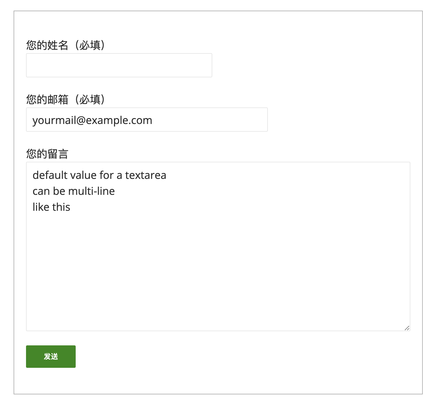
The default value of an input field is usually derived from the form-tag』s value part. It is, however, possible to get the default values from the context within which the form is placed.

To do this, add default:{source} option to the form-tag from which you want to derive the default value. Available data sources are: get (HTTP GET variables), post (HTTP POST variables), and post_meta (custom fields). Logged-in user information is also available.

For example, you have a field with a name 「your-name」:

[text* your-name]

To get the default value from HTTP GET variables, add default:get option to the form-tag:

[text* your-name default:get]

The field will obtain its default value from the GET variable with the same name (「your-name」). Try this by accessing the URL of the page of the form with an additional query string:

http://example.com/contact/?your-name=John+Smith

If it works correctly, you should see 「John Smith」 in the field.

Using the same logic, the custom field value is used for the default value of the field if: you have default:post_meta option in the form-tag; and the page containing the form has a custom field named 「your-name」.

But what if you have two or more default options in a single form-tag? Let』s consider this form-tag』s case:

[text* your-name default:get default:post_meta "Your Name"]

This form-tag has two default options and a value 「Your Name」. The options are evaluated from the first to the last. In this example, default:get is evaluated first. If the 「your-name」 GET variable has a value, it will be used for the default value. If that value is empty, default:post_meta will be evaluated next. If both of these options do not have values, 「Your Name」 will be used.
Share this:FacebookTwitterLike this:Like Loading...